2024
Salon Dashboard
Services
UX & UI Design, Journey Mapping, Prototyping, User Research.
Client
Fringe Hair Salon
Sector
Retail Management
Creating a Clear, Actionable Dashboard for Salon Management
Web Application
SaaS
PoS System
Operations & Sales
Small Business Tools
Overview
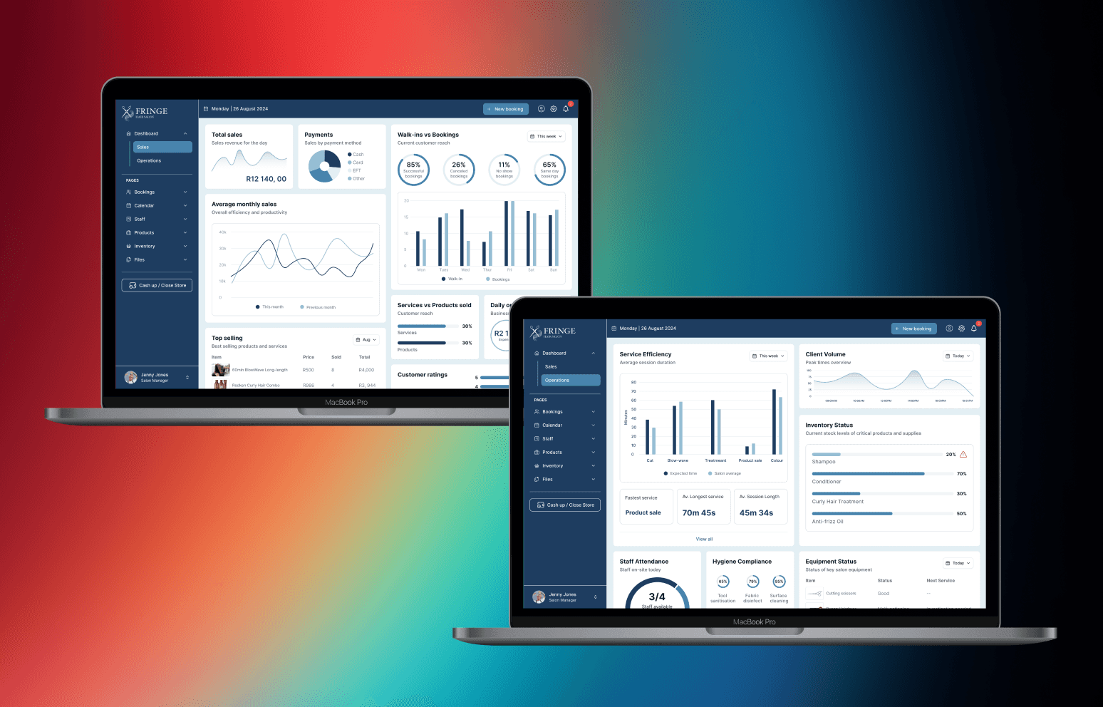
This was my first ever dashboard design, created as a hypothetical project over a weekend to address a real-world business scenario. The goal was to design an intuitive, user-friendly PoS and management system for salon owners and staff, combining operational efficiency with actionable sales insights. I focused on inventory management, client tracking, service efficiency, staff attendance, and sales analytics, creating a dashboard that enables managers to make informed decisions and optimize daily operations while giving staff a clear view of their responsibilities. The challenge was making complex data approachable and actionable for multiple user roles without overwhelming the interface.
Streamlining Salon Workflows
Operations & Multi-Role Dashboard
I designed the dashboard to consolidate service efficiency, staff attendance, hygiene compliance, equipment status, inventory tracking, and client volume into a single, intuitive interface. Empathy mapping guided feature prioritization, ensuring each user role; from salon manager to staff can access relevant, actionable insights. The design balances clarity and depth: managers can quickly spot low-stock items or peak hours, while staff can track attendance and service efficiency. By making complex operational data digestible at a glance, the dashboard supports faster, more confident decision-making and resource optimization.

Turning Data into Decisions
Sales Insights & Visualisation
The dashboard provides a comprehensive overview of daily revenue, monthly trends, bookings (successful vs. canceled), top-selling products and services, and walk-in vs. booking metrics. Metrics are presented through interactive charts, progress indicators, and concise summaries, enabling managers to make data-driven decisions on inventory, staffing, and marketing strategies. I focused on creating a balance between clarity and engagement, ensuring complex sales data is easy to interpret and act upon. The result is a system that helps both managers and staff understand performance, identify opportunities, and take informed action efficiently.

Learning Outcomes and Reflections
Takeaways
Designing this dashboard taught me the value of role-based prioritization in presenting data. I learned how to make complex operational and sales metrics intuitive for different users, balancing depth with accessibility. Working on my first dashboard strengthened my skills in data visualization, interactive design, and information hierarchy, and highlighted the importance of tailoring insights to the needs of each user role. If I were to revisit the project, I would expand customization options for each role, introduce real-time alerts and notifications, and explore more advanced analytics features to further enhance decision-making and workflow efficiency.

Conclusion
This project reinforced how clarity, structured layouts, and role-specific insights can transform data into actionable decisions for small businesses. Designing my first dashboard strengthened my ability to create intuitive, data-driven interfaces that support multiple user types and real-world workflows, laying a foundation for future projects in dashboard and operations-focused UI/UX design.
more projects